The path to our new mobile app: a look behind the scenes
After we decided at the beginning of the year to completely revamp the design and functionality of our previous mobile app, our development team launched the project full steam ahead. Now, four months later, when you see the finished result, it's hard to imagine the work involved in such a project. That's why we asked our developers in four mini-interviews what their tasks looked like during the development of the new mobile app.
Carlo explains that he was involved in various areas of development. "On the one hand, I dealt with the data flow from our server into the app. On the other hand, I was involved in error detection: If there is an error in the app - which of course we don't want - it is reported to us via a self-hosted tool and can therefore be fixed much more quickly. I also worked on the notifications that the user sees in the app at the end."
Christian was involved in internal data processing and utilisation. "The challenge here is to ensure that everything is consistent - in other words, that the latest data is always displayed and everything updates correctly. We were able to solve the problem of data consistency thanks to the new architecture."
Shubu mainly worked on the UI and UX design, i.e. how the app should ultimately look. "The UI concerns the design of the app that the user will later see when using it. This involves, for example, whether there is a square or round window, which colours are used, etc. Ultimately, the design should look as appealing as possible. UX design is about the user experience when using the app, i.e. making it as easy and intuitive to use as possible."
Remi led the project. "Over the turn of the year, I developed the basic framework for the mobile app. I conducted various experiments with the new development tool "Flutter", which worked very well. During implementation, it was important to me that the entire IT team was involved in the project so that the expertise was widely distributed. We had very positive experiences working on the same project. On the one hand, you naturally make faster progress, and on the other, it's also very good for helping each other and exchanging knowledge."
What can the new app do?
After all the background information, you're probably wondering what's possible with our new app.
New design
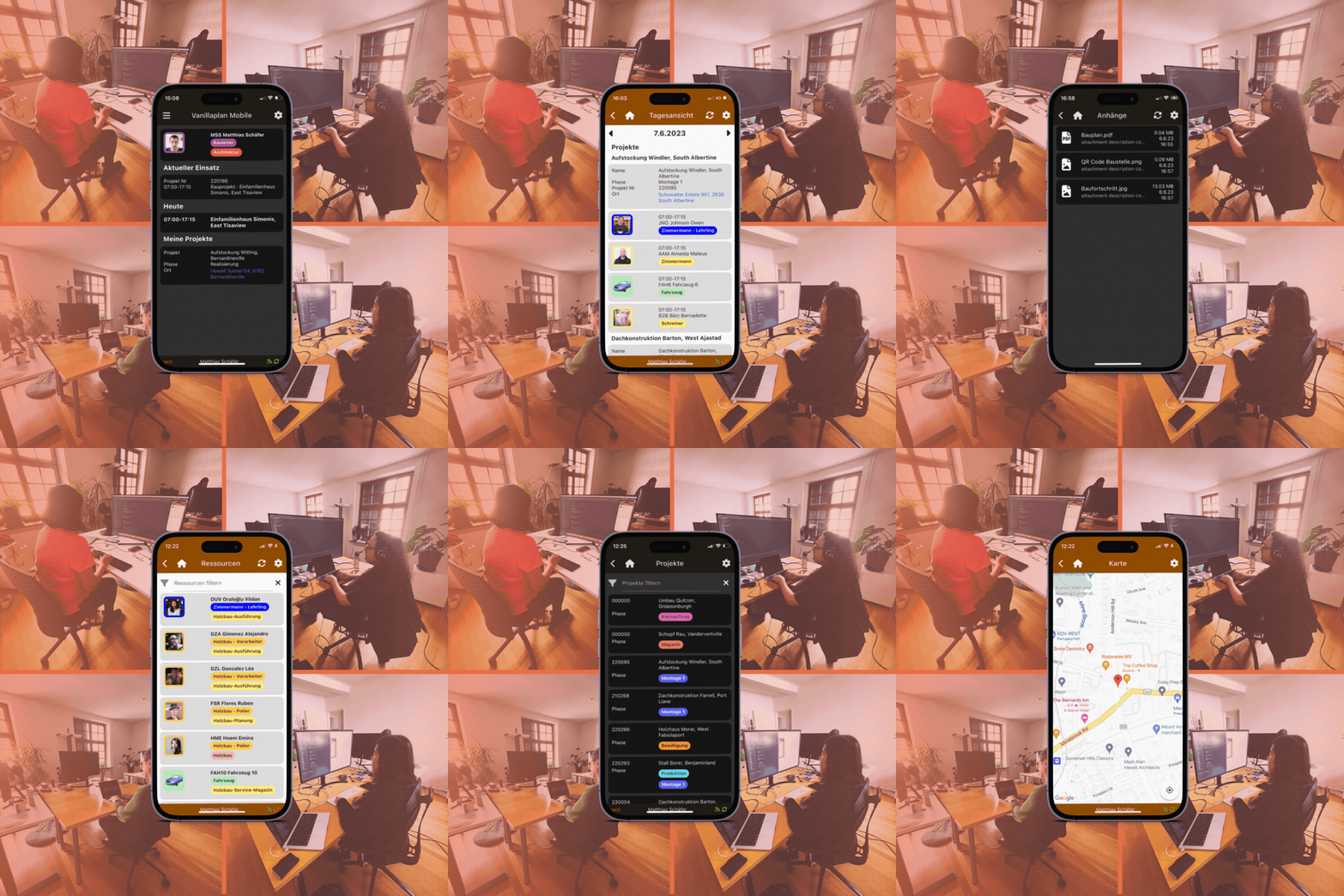
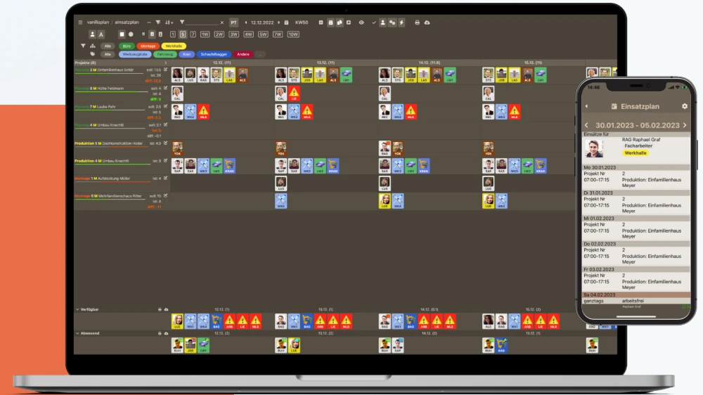
In terms of the visual redesign, the first thing you notice is the new design with light and dark mode. Whether you are a fan of the classic light mode or prefer the modern dark mode, the Vanilla Plan app gives you a personalised, quick overview of all your missions, including time, location and required inventory.
Simple transmission of file attachments
Of course, we have not only revised the design, but also finally realised our attachment feature. Whether construction plans, images or documents - in the new app you can quickly access PDF, image and Office files that have been added in the browser version. Conversely, the same files can be easily attached to the respective project in the master data in the Vanillaplan software. This means you always have the most important information in your pocket and are always informed about changes - both on the road and on the construction site.
We are very pleased to make the new version of our mobile app available to you from now on and invite you to download the update for the Vanillaplan mobile app. To help you understand how best to use the new app, we are offering a free webinar on 21 June to explain the new features. Please register here. If you are not yet using our app, we will be happy to advise you at any time. Have fun!


